


In my previous blog post, I shared my initial experience with using Power BI to analyze some transaction trends by customer type. I fully anticipated building upon this solution based off of new questions that arose as I explored the transaction data. That plan has been temporarily delayed since a new analytical challenge was brought up by one of my peers who asked to see a breakdown of revenue by state over a period of time. This new question presented me with an opportunity to use a new visual type in Power BI Desktop, a filled map and slicers. I’m sure I’ll have the chance to get back to expanding the Transaction Size BI Solution, but for now I’m diving into this geography based solution. This kind of redirection or change in reporting priorities is probably very familiar to most data professionals.
I’m continuing to work with Salesforce as my source for this new solution since the Sales Team at Pragmatic Works lives in this CRM and much of the data I need resides within in. Natively, Power BI Desktop provides 2 options for connecting directly to Salesforce:
- Salesforce Object (Both Standard & Custom) – In Salesforce, objects are fields that are grouped together based on category or tab. Examples include products, opportunities, leads and each of these objects contains a number of related fields that can be brought into a data model for reporting within Power BI Desktop. For a thorough explanation of Salesforce objects, you can read up on it HERE.
- Salesforce Reports – Within Salesforce, users can create various reports which can be connected to directly through Power BI Desktop. The benefit of connecting to a pre-built Salesforce report is that it should already contain the fields needed for your analysis which would eliminate the need for some data manipulation and mapping when modeling data.
Over the last 7 years, the Sales Team at Pragmatic Works has become very proficient in creating reports within Salesforce and I figured it would be easy to use one of the existing Revenue by State reports that presents all of the needed detail I planned to use in this new Power BI Revenue by State analysis. This is where I encountered my first hurdle:
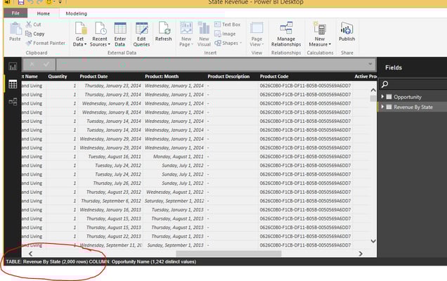
I did identify a previously created Salesforce report titled “Revenue by State” and I was able to connect and import the rows of data that make up this report…partially. There is a limitation with Salesforce reports as a source that limits the rows you can pull in per report to 2000. This would not be an issue if my Revenue by State report pulled over into Power BI as 50 rows as it appears in Salesforce. However, the report I connected to is aggregated from thousands of records (rows), each record representing a single transaction with state and dollar amount, which totaled far more than 2000 rows of data. Power BI Desktop didn’t throw an error or note saying that only 2000 rows of data from the Salesforce report could be pulled in, but this became obvious when I started getting incomplete results and noticed whole years of data missing as I worked to create the visual for the Revenue by State solution. Below is a screen shot of the table within the Power BI Desktop Data Pane showing the actual number of rows (2000) imported (circled in red at lower left corner of screenshot) from the Revenue by State Salesforce report that was made up of more than 30,000 rows:

Partial data will certainly yield a visual with bogus numbers….not good.
One solution is to identify the Salesforce Object or Objects that contain the fields with the needed values. This takes some extra poking around behind the scenes in Salesforce so be sure to enlist someone from your organization who understands the Salesforce data. In this case, the “Opportunity” object contains the needed State, Revenue and Date info which is the subject of this analysis. There is no 2000 record limit when connecting to Salesforce Objects, as is the case when pulling data from Salesforce Reports.
In the screenshot below I’ve highlighted the total number of records pulled over when connecting to the Salesforce Opportunity Object. All 35,038 rows that make up the data set:

I’m learning fast that the key to powerful analytics and visualizations is spending plenty of time in the Data Discovery, Data Transformation and Data Modeling playground which led me to re-watch a couple of the modules from the Pragmatic Works Power BI Desktop and Dashboards On-Demand Training course. I also watched a webinar from Pragmatic Works Principal Consultant, Rachael Martino. In her webinar, Performance Techniques for Power BI Data Models, Rachael uses Salesforce Data to demonstrate the data load time gains and report performance improvements when adhering to best practices in data modeling within Power BI. Her tip on reducing the number of columns pulled into Power BI yielded amazing load time and report response improvements for me. These resources are absolutely invaluable to me as I learn to work with Power BI. I look forward to sharing progress on the two concurrent Power BI projects I’ve got going.


-1.png)
Leave a comment