


In this tutorial, I will show you how to pull data into Excel using Power Query and then put together a simple report with Power View. While you can get rather elaborate with these tools, this tutorial will begin with a simple focus. I am going to create a report that displays sales amounts from different countries over a period years.
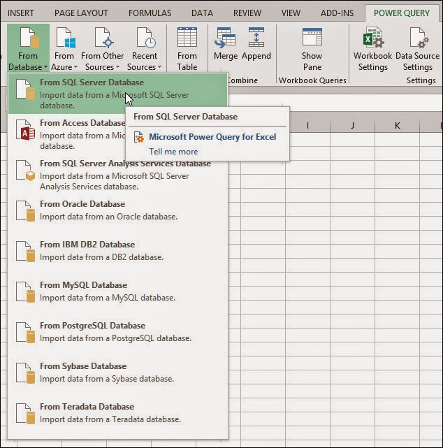
First, launch Excel and in a blank workbook, select Power Query. Click the 'From Database' option and then select 'From SQL Server Database'.
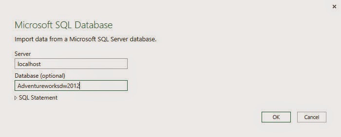
In the connection window, enter a server name and database name. For this example, I am pointing to my local server and the AdventerWorksDW2012 database. In the previous post from today, I used a query, but I'm not going to use it this time.
When I click OK, the Navigator window opens to the right and displays all the views, tables, and functions in the database. This is where I can select which object I would like to pull from. It is possible to select multiple tables, but I only need to select one in this case. In the navigator pane, right click the DimReseller table and select Edit. This will open the query editor.

In the editor, all the columns of the DimReseller table are displayed. I don't need all of these, so I will remove some of them later. Scroll all the way to the right to see columns from other tables that are related to this one. Notice the column header displays the name of the tables and their is an 'Expand' icon next to the table names.

Click the Expand icon next to DimGeography. This will open a filter menu of all the columns in the DimGeography table. Uncheck the 'Select All Columns' option and select 'EnglishCountryRegionName' and then click OK.

This will add the Country column to the data displayed in the query editor. Now, expand the FactResellerSales header. Uncheck the 'Select All Columns' option and then select SalesAmount and OrderDate. Click OK. Now that I have the columns I am interested in, I need to remove columns I don't want. Basically, all I need to do is right click the headers of the columns I don't want and choose the option to remove them. There are a lot I don't need.
Remove columns until you are left with ResellerName, EnglishCountryRegionName, SalesAmount, and OrderDate. I also kept the address columns even though I may not need them, unless I want to play different options in Power View. Click 'Close and Load' in the upper left corner of the Query Editor ribbon. This will load the data into Excel.

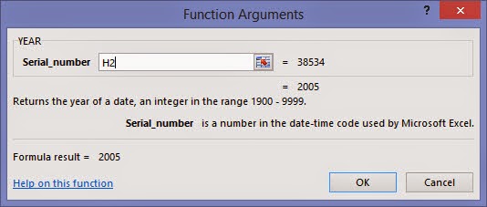
There are a few more little tweaks I want to make to this. First, rename the columns so the make more sense. Since I will be looking at data by year, I only need the year part of my OrderDate column. There are different ways to achieve this, but I am going with fast and easy. I will use an Excel function. Click the cell on the end, next to the first value of the OrderDate column. Next to the formula bar, click on the function button. This opens a list of functions. In the category drop down menu, select 'Date & Time' and then, in the list of functions, select 'Year'.

Click OK. Now it asks for a serial number. All I have to do here is type in the first cell number of the column I want to alter. For example, the first value of the Order Date column is in cell H2. So, I will type that as the serial number.
Click OK. That will take the year part of the date and display it in a new column. Rename the column as Order Year.

Click on the Insert tab in the ribbon and select Power View. A generic table is displayed:

You can choose different styles of charts in the ribbon. The style you choose will be influenced by the type of data you would like to display. For this example, I will choose a clustered bar chart. When I select that kind of chart, Power View takes a guess as what should be displayed and how. I will be moving some items around here. I need to clear out the Values, Axis, Legend, and Vertical Multiplier fields, because they are all wrong as you can see below:

After clearing them out, I add Sales Amount to the values field (make sure it is summed), Year to axis, and Country to legend. It should look something like this:

The end result is a clustered bar chart that shows total sales by country and shows how the sales have increased.

This is just a simple example of pulling in data through Power Query and then visualizing it with Power View.
Want to learn more from Shawn? Follow him on Twitter!


-1.png)
Leave a comment